You sit down to brainstorm a project. Ideas swirl in your head, but notes on paper turn into a mess. Recent studies show mind maps cut that chaos. They boost memory by 10 to 32 percent compared to lists, because visuals mimic how your brain links thoughts.
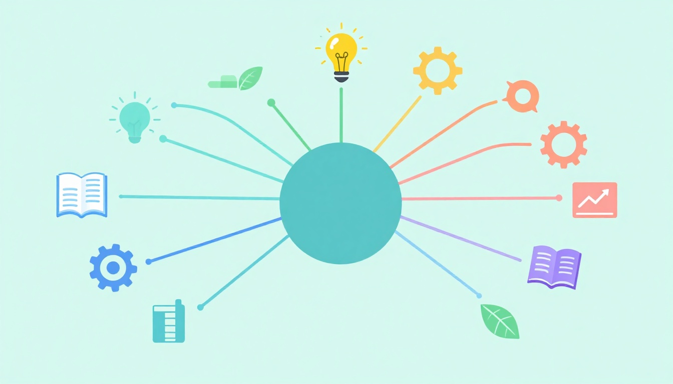
A mind map starts with one central idea. Branches spread out like tree limbs to show connections. This setup helps you study smarter or plan faster. People use them for everything from exam prep to business strategies.
You’ll see the key elements of a good mind map here. We cover the center, branches, visuals, and flow. Plus, real examples and 2026 tools with AI smarts. These build clearer ideas and better recall. Let’s start at the core.
Craft a Powerful Central Idea That Anchors Everything
Every strong mind map has a bold center. It holds the main topic right in the middle. Think of it as the anchor that keeps everything focused. Without a clear one, your map drifts into confusion.
Place a single word or image there. For market research, use “Research.” Make it big and colorful. This grabs attention and aids memory. Studies confirm visuals in the center stick better than plain text.
Keep it short. One to three words max. Vague centers like “Stuff to Do” fail. They dilute focus. Instead, pick “Launch Plan.” This sets direction from the start.
Colors help too. A bright blue circle draws the eye. Add a simple icon, like a lightbulb for ideas. Your brain processes images 60,000 times faster than words. So, visuals win.
Common mistakes hurt. Skip sentences; they clutter. Don’t hide the center off to the side. Center it always. Test yours: Does it sum up the whole map at a glance?
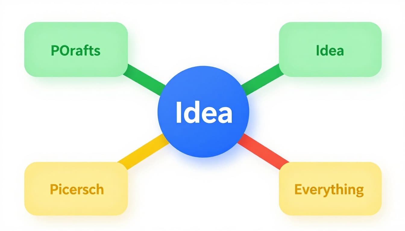
This example shows a strong center. Branches hint at growth without details yet.
Tips for Choosing and Designing Your Center Node
Brainstorm your core topic first. Ask: What’s the one big question? Write options, then pick the sharpest.
Use images over text when you can. A globe beats “World Capitals.” Free stock icons work great.
Pick vibrant colors. Blue for calm topics, red for action. Limit to one or two shades.
Make it larger than branches. Twice the size stands out. Bold fonts help too.
These steps boost recall, per research on visual learning.
Build a Solid Structure with Main Branches and Sub-Branches
Main branches form the backbone. Draw three to five thick lines from the center. Each handles one key subtopic. For “World Capitals,” try “Europe,” “Asia,” “Americas.”
Use single words or short phrases. “Data Collection” beats full sentences. This keeps things clean and scannable.
Sub-branches add details. They sprout thinner from mains. Limit to two or three per branch. “Surveys,” “Interviews” under Data Collection.
Start freeform. Jot ideas fast, then rearrange. Curves feel natural, like thoughts flow. Straight lines work for rigid plans.
Hierarchy matters here. Thicker lines show mains. Thinner ones for subs. This guides the eye outward.
Benefits shine in chaos. Mind maps turn random notes into logical paths. You spot gaps quick.
For more on basic parts, check MindManager’s 10 elements guide.
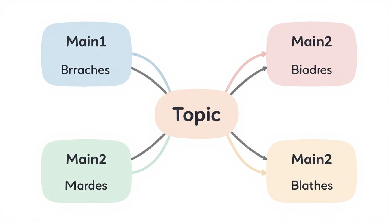
See the balance. Four mains, even subs, no overload.
How Many Branches and How to Keep Them Balanced
Stick to three to five main branches. More crowds the page. Chunk info into groups first.
Brainstorm freely. List all ideas, then group. Balance lengths; even branches scan easier.
Adding Depth Without Overloading: Sub-Branch Best Practices
Label subs with punchy words. “Stats” not “Gather statistics here.”
Curve lines for flow. They guide eyes smoothly.
One word per branch ideal. Adds speed and clarity.
Make Ideas Pop with Colors, Images, and Symbols
Colors code your map. Assign one per main branch. Red for urgent tasks, green for growth areas. This speeds scans.
Images and symbols amp recall. Add a flag icon to “Europe” capitals. A heart for blood flow steps. Simple doodles suffice.
Limit your palette. Five colors max avoids rainbow mess. Pastels soften; brights energize.
Hand-drawn feels personal. Digital tools add polish fast. Both boost fun and memory.
Research backs this. Visuals engage more brain areas, so ideas stick longer.
In 2026, AI tools suggest icons auto. They match your theme smartly.
Examples help. Flame for risks, leaf for benefits. These make maps alive.
Colors and icons make branches distinct here.
Smart Ways to Choose and Apply Visuals
Match colors to meaning first. Red signals stop or hot topics.
Source free icons online. Or doodle quick sketches.
Hand pros: tactile, no learning curve. Digital cons: less feel, but shares easy.
Test: Does each visual add meaning? Cut extras.
Establish Clear Hierarchy and Connections for Better Flow
Hierarchy shows levels. Bold, thick lines for mains. Fade to thin for details. Size drops outward.
Connections link ideas. Dotted arrows join related branches. “Risks” to “Actions” in a plan.
Review often. Tweak lines for clarity. This reveals patterns you miss in lists.
Benefits include better flow. You see priorities and links at once.
In 2026, AI suggests connections. Tools predict strong ties from your notes.
Blood flow example: Arrows show path, colors stages.
For best practices, see this 52 tips guide.
Thickness and arrows create clear paths.
Put It All Together: Examples and Tools to Get Started
Combine elements for power. Take “Market Research.” Center: Bold “Research.” Mains: Data Sources (survey icon, blue), Analysis (chart, green), Insights (lightbulb, yellow), Actions (arrow, red). Subs like “Online Polls” under Sources.
“World Capitals”: Center globe. Branches by continent, flags as symbols.
Blood flow: Heart center, red arrows for path.
See full mind map examples for everyday use.
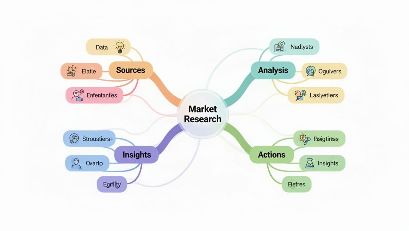
This Market Research map ties it all.
Tools shine in 2026. MindMeister excels at collab and colors. Coggle auto-layouts exports. AI in Flowodo generates from prompts.
| Tool | Best For | Key Features |
|---|---|---|
| Flowodo | Quick AI maps | No signup, cheap pro |
| MindMeister | Teams | Real-time edits |
| Xmind | All devices | Offline sync |
Digital beats paper for shares. Paper wins for quick sketches. Try one today.
Conclusion
Good mind maps rest on these: strong center, balanced branches, visuals, hierarchy, connections.
They transform scattered thoughts into clear plans. Productivity jumps; recall lasts.
Grab paper or a tool. Sketch your next project now. Share what you build in comments.
AI tools future-proof your skills. What topic will you map first?