Picture this. You sit down for a big project. Pen in hand, you sketch a mind map to organize your thoughts. Excitement builds as branches spread out. But soon, it turns into a tangled web of scribbles. You waste hours staring at the mess, no clearer than before.
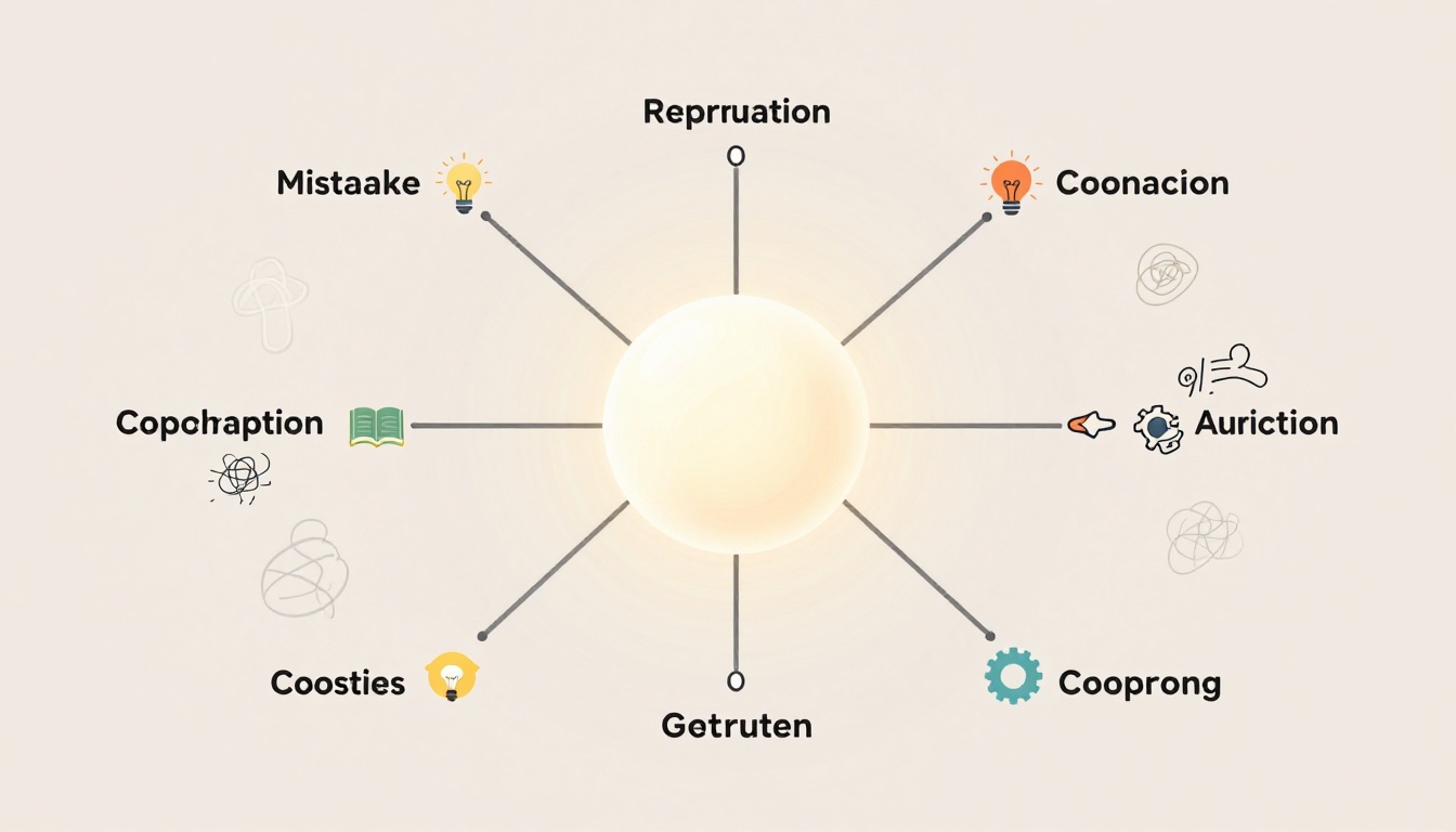
Mind maps serve as visual tools. They start with a central idea. Branches radiate out to show links and spark fresh thoughts. People use them for planning, studying, or brainstorming. Yet common mistakes when making mind maps trip up beginners and pros alike. Recent 2025-2026 insights show folks overload with text, skip visuals, or start too vague. These errors kill clarity and waste time.
You can fix them fast. Each section below spots a key flaw. It explains why it hurts, then shares simple tweaks. Follow along, and your next map will clarify chaos into action.
Starting with a Fuzzy Central Idea That Derails Everything
Your mind map’s heart is the central bubble. A weak one dooms the rest. Vague phrases like “things to do” or “stuff about work” confuse from the start. They lack focus. Branches wander off track because no one knows the true aim.
Take two examples. A bad center reads “stuff about work.” It invites random ideas: emails, meetings, coffee breaks. Nothing connects. Now try “Q2 sales strategy.” Branches snap into place: targets, tactics, timelines. This sharp focus sets a strong tone. Everything ties back.
In 2026, experts stress action-oriented centers. Make yours specific. Brainstorm first. Pick one phrase that nails your goal. Say it aloud. Does it click? If not, refine. Test by asking: Can a friend grasp it in seconds?
This fix keeps maps tight. You avoid sprawl. Recent trends push living maps that update often. A clear center makes refreshes easy.

Why Broad Topics Lead to Overwhelmed Branches
Broad centers force too many sub-ideas. Picture “improve life.” Branches explode: health, career, family, hobbies. Clutter builds fast. No room for depth.
Narrow it down. Swap for “boost daily fitness.” Now branches fit: workouts, meals, tracking. Before-and-after shows the win. Messy side drowns in extras. Clean side breathes.
Focus on one goal. This cuts overwhelm. Your map stays useful.
For more beginner pitfalls, check 9 mind mapping mistakes from XMind.
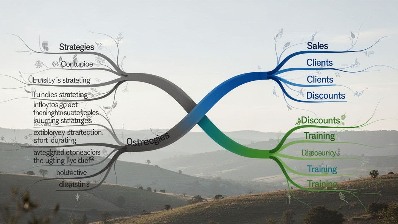
Cramming Branches Full of Long Text Instead of Keywords
Branches should spark ideas, not bury them. Yet most folks cram full sentences. “Improve sales by calling more clients and offering discounts while training the team next quarter.” That’s 15 words. It reads like a dull list. Scanning slows. Connections hide.
Data from 2026 shows overload hits hard. People pack 10+ words per branch. Maps turn dense. No fun, no speed.
Switch to keywords. Limit to 1-3 punchy ones: “Sales: Clients, Discounts, Training.” Ideas flow fast. Your brain fills gaps. Add icons for detail. A phone for calls, a trophy for wins.
This keeps maps scannable. Thinking speeds up. Tools now flag overload. Use them.
Test it. Cover the text. Lost? Simplify. Benefits stack: quicker reviews, better recall.
How Word Overload Turns Creativity into Confusion
Bloated branches kill spark. Example: “Meet with boss to discuss promotion after finishing report and updating resume.” Yawn. Slim it: “Promotion: Boss, Report, Resume.”
Grayscale straight lines make it worse. Color and curves revive it. Cover bloated text. Meaning vanishes. Slim version shines.
Always trim. Creativity thrives in space.
See 7 common mind mapping mistakes for similar tips.
Skipping Colors, Images, and Curvy Lines for Boring Maps
Plain maps flop. Black text on white paper mimics rigid outlines. No flow, no memory stick. Straight lines feel stiff. They block natural paths.
Curves mimic brain links. They guide eyes smoothly. Colors group ideas. Blue for goals, red for risks, green for actions. Images spark recall. Swap “idea” for a lightbulb doodle.
2025-2026 trends demand vibrant maps. Ditch grayscale. Grab markers. Doodle quick icons. Bend every line. Results? Maps pop. Recall boosts 20-30%. They stand out in meetings or notes.
Group fails like this. No colors muddle themes. No images dull recall. Straight lines cramp style. Fix each for lively results.
Start simple. Color one branch. Add a sketch. Watch engagement rise.
The Power of Curves Over Straight Lines
Straight lines scream outlines. Curves invite exploration. Verbal sketch: Rigid tree with sticks. Versus flowing river of thoughts.
Waves show natural ties. Ideas connect better. Always curve. Flow improves.
Why Your Map Needs Color and Quick Sketches
Color-code branches. Blue goals link fast. Icons beat words. Lightbulb for ideas, clock for deadlines.
Examples abound. Plain “risks” fades. Red flag icon warns. Memory locks in.
For visual best practices, explore Atlassian’s mind mapping tips.
Copying Generic Templates and AI Outputs Without a Personal Twist
AI shines in 2026. Yet cookie-cutter maps flop. Generic templates repeat buzz: “creative synergy.” No spark. They lack your voice. Portfolios suffer.
Same with copies. Trendy designs bore. No unique links or stories.
Fixes start on paper. Sketch freehand. Tweak AI outputs. Add personal examples: your sales win, not vague stats.
Pro tip: Explain your map to a friend in one minute. They get lost? Simplify. Tie in real life.
This avoids repetition. Maps stand out. Emotional precision trends now. Map exact feelings or niches. Yours beats generic every time.
Trends push hybrids: paper sketches scanned to digital. Always personalize. Results shine.
Check student mind mapping errors for more.
Mind maps transform when you dodge these pitfalls. Fuzzy centers derail focus. Word overload buries ideas. Missing visuals bore the eye. Generic copies lack soul.
Fix them, and clarity wins. Thinking sharpens. Productivity soars in 2026’s fast pace. Living maps with AI tweaks stay fresh.
Grab paper now. Sketch one mistake-free map. Share your win in the comments. What branch popped first? Turn your next project into clear action. Chaos fades; success branches out.